a recent post on Jason Kunkel's blog (link) about users purging the entire model made me think about sharing a piece of our template setup to prevent this.
Families can only be purged if there's not a single instance of that family anywhere in the model. So the solution is pretty simple... create a legend view and place an instance of every text type, line type, tag, region, detail item , or even family. We have a few of these "anti-purge" legends (drafting elements, detail items, families), which also serve the purpose to check the families.
As long as there's at least one instance somewhere, nobody can purge it.
Revit Templateer
Revit Templates: how to Set it & somewhat Forget it
Saturday, August 1, 2015
Sunday, February 8, 2015
Upside Down Elevation
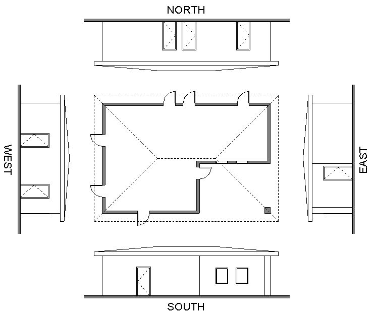
For presentation purposes, I like to show exterior elevations aligned with the floor plan. It makes it easy to understand the drawings.
Once placed on the sheet, it's easy enough to align the South elevation with the floor plan, because it has the same orientation. The East and West elevation can be rotated on the sheet by changing the Rotation on Sheet in the options bar. There is, however, no option to rotate a view 180° for the North elevation.
A workaround is to create a call-out in the North elevation. Then activate that view, and rotate the crop region by 180°. The call-out view is then placed on the sheet, and aligned with the floor plan. It's that simple!
Once placed on the sheet, it's easy enough to align the South elevation with the floor plan, because it has the same orientation. The East and West elevation can be rotated on the sheet by changing the Rotation on Sheet in the options bar. There is, however, no option to rotate a view 180° for the North elevation.
Thursday, January 29, 2015
Life Safety Exit Separation
Today, I spent some time developing a family for our Life Safety drawings, showing exit separation, based on the diagonal of the area served. This family refers to the Florida Building Code (2010), so if you download it for your own use, be sure to update the code references/calculations as needed.
Code References:
Code References:
- 1015.2.1 Two exits or exit access doorways.
Where two exits or exit access doorways are required from any portion of the exit access, the exit doors or exit access doorways shall be placed a distance apart equal to not less than one-half of the length of the maximum overall diagonal dimension of the building or area to be served measured in a straight line between exit doors or exit access doorways. Interlocking or scissor stairs shall be counted as one exit stairway.
Exceptions:
- 2. Where a building is equipped throughout with an automatic sprinkler system in accordance with Section 903.3.1.1 or 903.3.1.2, the separation distance of the exit doors or exit access doorways shall not be less than one-third of the length of the maximum overall diagonal dimension of the area served.
- Now, the family is a line based detail item with a nested generic annotation, containing two types and an instance parameter to indicate a sprinklered or un-sprinklered building. The code reference and minimum exit separation distance are automatically adjusted/calculated based on the length of the family and sprinkler parameter.
- The family can be downloaded from here (2015).
Tuesday, January 7, 2014
Scheduling the same parameter twice
I recently received
an equipment schedule for a commercial kitchen in one of our projects, which appeared
to have been created in CAD. Since it’s a pretty wide schedule, the item number
column on the left had been duplicated halfway the schedule and to the right, making it easier to read across a row.
I had never seen
this before and it sparked my curiosity, since a Revit schedule only allows us
to show a parameter once. The trick here
is to use calculated values. Hitting the button with the three dots on the right of the Formula field will show you any available parameters to be used in a formula.
I tried this for an array of parameters in a door schedule, and it appears to work for most parameters, but certainly not all. In the example below, it didn't work for the Function parameter, but did work for Finish, Operation and other text parameters.
Friday, January 3, 2014
Slab Depressions
Some time ago, I
helped out on a project that had a lot of slab depressions that seemed to keep on
changing all the time. The problem was in their setup; the sketch of the main
slab had to be edited to create a void, after which a new slab with a negative
offset was modeled inside that void. Lastly, a slab edge had to be added
matching the depth of the slab depression, after which all elements had to be
joined so the section would read cleanly. Certainly a few steps too many, and that's when I get unhappy.
It didn't take
long to create a rectangular and an L-shaped stretchable generic model that creates a slab depression and performs all the above mentioned steps at once.
The geometry was based on this structural detail, and
adapts to the thickness of the host slab.
For starters, I created types for 1”, 2”, 3”
and 4”.
If a section is cut through them, joining the slab and the depression
family will clean up the linework.
The files can be
downloaded here (2013).
Tuesday, November 12, 2013
space planning tool
Another one from the bag of tricks is a simple stretchable detail item to represent rooms during space planning. Much like a sheet of trace paper to lay over your floor plan, this detail item affects none of the model elements allowing for very quick exploration of a few schematic options without the use of design options. Since this is a detail item, it's only visible in the view the work is done.
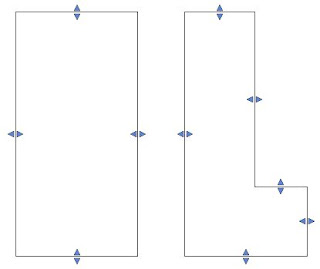
Two families have been created; one rectangular, the other L-shaped. A few types have been set up to show different wall thicknesses. A simple tag shows labels for the room name (optional), width & length (finish to finish), and resulting area.
Edit: I nested the tag as a generic annotation inside the space planning tool. The tag now shows up as soon as you place the space planning tool family. A link to the new families can be found below.
Edit: I nested the tag as a generic annotation inside the space planning tool. The tag now shows up as soon as you place the space planning tool family. A link to the new families can be found below.
By using reference planes and reference lines, the families will snap to each other, making it easy to align them. A center line for the wall thickness was added for reference.
Tuesday, September 24, 2013
How to dimension a funky curved wall
This post isn't really template related, but I wanted to share it anyways. Some time ago I had to dimension several complex curvy corridors and it became quite an ugly cluster of dimensions with center points often landing far outside the building. In an effort to simplify this for the framer in the field, and to keep our drawings neat, I came up with the following setup:
The dimensions shown are actually line-based detail items with a tagged length parameter. The tick mark and arrow at the end of the dimension are nested generic annotations, so they will scale properly. The unit precision for the tag is set to the nearest 1/2".
I decided on a 4’ spacing and since a grid wasn't nearby, I created an arbitrary reference line (dashed line) to dimension from; the reference line was then dimensioned back to the closest grid. The fastest way to do this is to create a single instance with a tag and copy it over every 4’. Then you can use the extend multiple to align all dimensions to the face of stud.
On site, anyone can lay this out and connect the dots, but as always, I would like some feedback on this approach, especially from someone with more framing experience than myself.
The families can be downloaded from here (2013).
Edit: I recreated the family in 2013 and added a few new types as shown. I also added a double horizontal control to allow for flipping the direction when using the Arrow - Line type:
Friday, September 20, 2013
Scope Boxes
Our template already has a lot of views created, which makes it easy at the beginning of a project, but a lot of work to adjust the crop boxes of all these views… if it weren't for scope boxes. A scope box can control the size of several views at once and makes sure they all match each other in size. Changing the size of a scope box will change the size of all views accordingly. It's a huge time-saver!
It’s not always easy to get people to use scope boxes. Often, they are one of the first things to get deleted from a project because “I didn’t want to see those red boxes.” As a result, we have now turned off scope boxes in all our view templates. They could even be added to their own workset that’s invisible in all views. Consultants will appreciate this as well since our scope boxes would otherwise show up in their model & views as well.
Some of the scope boxes currently set up are Overall for 1/16" views, and areas A, B, C & D for 1/8" views. The choice to use 4 areas was based on our typical project size, but if fewer are needed, they can easily be deleted. To make adjustments, a 'Scope Boxes' view has been set up where you can move & stretch or delete them as needed. For clarity, all model elements are set to halftone.
Some of the view types that have scope boxes assigned in the template:
- overall and area floor plans (demo and new)
- overall and area reflected ceiling plans (demo and new)
- overall life safety plans
- overall and area equipment plans
- overall and area floor finish plans
Views have been named accordingly:
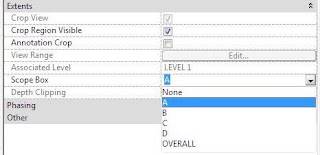
To assign a scope box to a new view, change the view’s properties under ‘Extents’:
To create a new scope box, either copy an existing scope box or create a new one:
It’s not always easy to get people to use scope boxes. Often, they are one of the first things to get deleted from a project because “I didn’t want to see those red boxes.” As a result, we have now turned off scope boxes in all our view templates. They could even be added to their own workset that’s invisible in all views. Consultants will appreciate this as well since our scope boxes would otherwise show up in their model & views as well.
Some of the scope boxes currently set up are Overall for 1/16" views, and areas A, B, C & D for 1/8" views. The choice to use 4 areas was based on our typical project size, but if fewer are needed, they can easily be deleted. To make adjustments, a 'Scope Boxes' view has been set up where you can move & stretch or delete them as needed. For clarity, all model elements are set to halftone.
- overall and area floor plans (demo and new)
- overall and area reflected ceiling plans (demo and new)
- overall life safety plans
- overall and area equipment plans
- overall and area floor finish plans
Views have been named accordingly:
To assign a scope box to a new view, change the view’s properties under ‘Extents’:
To create a new scope box, either copy an existing scope box or create a new one:
Tuesday, September 17, 2013
Grid Cleanliness
Grids are pretty important in ensuring model cleanliness; we all rely on their accuracy when we work on our models, yet they’re just so easy to nudge, and we may not realize they’re no longer accurate. Even worse, a modeler may not care as much about model precision and figure that 90.27 degrees or 20’-0 127/256” is good enough. Once the grids are off, it could take days before this is discovered, and even longer to repair the damage across all disciplines. It’s a real snowball effect.
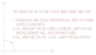
That’s why I feel it’s important to set up a grid view early in the project, or even better, make it part of your template. This grid view isolates all grids in the model and quickly points out any errors. The grid view monitors spacing & rotation, worksets and locking of grids; of course, it can only be effective if monitored repeatedly by the BIM manager.
For clarity, I’ve set the view scale to 1/32” and am using the following graphics settings:
- Model Categories:
hide all, except for a single construction line type
- Annotation Categories:
hide all, except for dimensions, grids and text notes
- Analytical Model Categories:
uncheck ‘Show analytical model categories in this view’
- Imported Categories:
uncheck ‘Show imported categories in this view’
- Filters:
create a ‘Grids - on wrong workset’ view filter and set the projection lines to be dashed red
- Worksets:
Set all worksets to ‘Show’
- Revit Links:
Leave all linked models turned on and set them to halftone
Now that we have a clean view, we can dimension all grids and quickly spot any inaccuracies; this can only be effective if our precision settings are set correctly. See my post on unit settings and dimensions here.
Next, because we set up a view filter earlier, we can easily identify those grids that are on the wrong workset.
Lastly, I add all grids to a dedicated design option called ‘LOCK - Grids’. This requires that making adjustments to grids is done as a conscious act, and not by mistake. You may get some resistance to this step, but it’s worth the extra step.
Tuesday, September 3, 2013
"Template" pre-loaded with worksets
I’m not sure if this has been blogged about before, or
who even suggested this at our firm, but our template isn’t a real template; it’s
a workshared project with worksets.
Note that every link has a dedicated workset. This allows
us to be selective about which links we want to load when we first open up our
active project.
Some of the benefits are:
-
multiple people can work on the template, at the
same time
-
workset naming standards is established,
everybody is familiar with these
-
shorter initial set up time
but more importantly:
-
view templates can be set to include what
worksets should be visible or hidden. In my opinion, this one is huge; it’s otherwise
impossible to complete the setup of your views & view templates prior to
starting the project.
Be cautious though, if somebody starts a new project without
detaching their copy, they could do a lot of damage. This is why our template
files are located on a drive that just a few people have writing permission to. When we start a new project, there are two different
approaches: open a detached copy of the template model, or opening the template
model and doing a Save As with the ‘Make this a Central Model after Save’
option checked. The starting view has a reminder for the person setting up the project.
Thoughts?
Subscribe to:
Comments (Atom)


